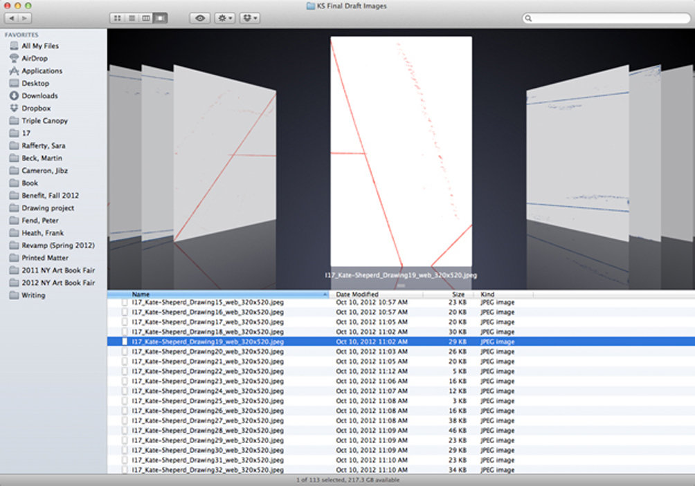

Screenshot of scanned drawings that make up “Were I to Write a Longer Letter.”
Kate Shepherd speaks with Triple Canopy’s Lucy Ives about taking liberties with the alphabet, the personalities of letters, and the “piles of lines” that constitute “Were I to Write a Longer Letter,” her 113-part drawing published in Triple Canopy issue 17.
Lucy Ives: When I first looked at your piece, my impression was that I was looking at lines that had been printed in some way.
Kate Shepherd: The impulse was that it address both tactile art making and the format of the magazine itself. I had in mind the image of a kid walking down a hall with a piece of chalk, holding the chalk out and marking the walls as he went. The beauty of it was not only in making the drawings but also in playing matchmaker afterward. Editing this on a computer, you get to copy and paste. I tried to do that as much as I could, to point to the medium. To envision it, I recreated the website’s page on my table right here.
LI: On this particular table?
KS: On this table. I wanted to find a graphic system that was playing off the crispness of a computer screen, where mark making is seen but not felt. I had strips of tape that had measurements on them, and I used thread, putting individual pieces paper on top and going over them with carbon. I never knew how the thread would move under the paper, so there was an element of blindness. And there are subtle things the lines do, bends I could never have done by hand. That’s the nature of thread. It’s like being with somebody you find predictable and then noticing a little quirk.
LI: For example?
KS: I started to attribute characteristics to certain elements, like a button may have been having a cigarette. Or maybe it has a leash, and it’s a dog smoking a cigarette. There is a feeble “P,” and there are forward buttons to usher the eye, and then something that looks to me like a Joel Shapiro. There are steps and uneven arrows that I call breasts, doors that open and play with the planes of the page. As an excuse to make a word in lines and almost unreadable, there is a “NINA,” since I grew up with the Hirschfeld drawings every Sunday in the Arts & Leisure section of the New York Times. I probably should have made two, to be true to Hirschfeld’s practice. He would make one super skinny, and another obscured in a different way—they were really crazy at times. The “W” here is taking creative liberties, the “N” could have been written by a preschooler. And there is a repeating line that looks like a clothesline. I love that the “V” looks like a woman’s legs that are just way too open. And the poor “T” fell down. The letters act as signs and personalities but then can be reduced to their components: lines.
LI: It reminds me of learning to write, that problem of figuring out how many horizontal lines need to participate in an “E.”
KS: I think the beauty of the alphabet is that it points to how we inhabit two worlds. We inhabit both a conscious, shared world and the world of the unconscious. It’s a very romantic idea, but we actually do. The pile of lines I drew threatened either to connote something or to not connote something, but I preferred that they did. I’m talking about a collaboration between what’s available and how we recognize. In this sense, I think of language as a way of evoking parallel systems. And for the colors of the piece, I wanted there to be only three, and I wanted them to be the classic Bic-pen trio. You may or may not recognize that, but then maybe you start thinking about something else, like how the black and the blue when they touch are like siblings who are so close in age you almost think they’re twins.
LI: It seems like you are telling a joke very skillfully, but I don’t have to laugh if I don’t want to. The joke is good even if it doesn’t make me laugh the first time I hear it.
KS: It is an interesting cognitive process that requires a great deal of honing, to bring words to looking. With other people’s paintings, I look in a very rational way. I like to ask them questions and see if I get an answer. If I don’t, I might ask a different question. Then I might lose patience and move on. I’ll do this with really old paintings. I’ll say, “How can you get away with that composition?” or, “What’s your palette and dominant color?” And the painting will invariably tell me about its geometric premise, and what its color system is. I’ll say, “OK, what’s your dominant shape? How are you constructed?” I’ll ask about the hierarchy of points of interest. Nowadays I’m most fascinated by how things are constructed. Vermeer, Morandi, and certain Velazquez are of great interest because of the way they’re put together. And Chardin. By the way, Morandi, in my book, is really making visual puns. Show me just about any Morandi, and I’ll tell you the pun he’s making. But really, I have a harder and harder time looking at paintings. Perhaps it’s shameful, but nowadays looking is a little like shopping.
LI: It’s not a question of learning?
KS: If you’re thinking about learning as meeting a stranger, then, no. I think it’s about having more profound learning, about understanding a visual vocabulary more because you’ve already been aware of it and taken stock if it. Once you take stock, you add and refine.
LI: Do you want to have the sense that your work refers to other work, or could be a meeting point for other work?
KS: I think a lot of artists ask themselves that.
LI: What do they decide?
KS: They’re trying to claim a lane. But I’m not concerned with that because I’m mainly trying to excavate by recognition. When I look at some work of mine, if I see a very clear connection, I know that I have to either enjoy and articulate that reference more strongly or back off. Plus, if I can’t get a hold of a personal visual memory or a certain emotional association, then it doesn’t fly. In the museum, I locate what I may already have intuitively discovered in my studio. Finding affinities allows me to expand image references, validate them, keep them company.
LI: It seems like much of your work is about figuring out problems of relation. You aren’t simply putting references together or being influenced by some trajectory that already exists; rather, you want the interrelatedness of visual information to take on new forms.
KS: Yes it’s true; it’s almost like it is in grammar. In the past perfect, we jump behind to go ahead. And often painting is to me like the past perfect, a future looking forward from within the past. I intend to start here, in the present, but then I want to go back into the past, and then look forward once I’m there. It’s not nostalgia, because I’m not just looking back. It’s almost like going behind nostalgia.