Writing about graphic design and its history in the Philippines is a quandary because there is barely any reference material, local or otherwise, dedicated to the subject. One must often use foreign material in order to make a local reading. Another method: Extrapolate from the work of Filipino thinkers in related fields and cobble together a prosthetic theory of graphic design, pockmarked by syllogisms and mixed metaphors. One could also take to the streets and record observations over beers, with graphic designers and their clients, few of whom will go on record. Or one could Google and hope that the Internet is not lying too much. If none of these approaches are fully recommendable on their own, perhaps all of them together might help a writer elucidate a more comprehensive, if far from perfect, picture.
Team Manila
Team Manila was founded in 2005 by Jowee Alviar and Mon Punzalan, and has since established itself as one of the premier design studios in the Philippines. The studio began as a T-shirt design company and later morphed into a firm attached to a chain of retail stores. The lifestyle souvenirs on offer include pencil cases, lunch boxes, backpacks, lanyards, and pairs of socks. The products are all instantly recognizable for being emblazoned with intricately layered, multicolored, and vectorized local imagery: jeepneys, Shepard Fairey–esque portraits of national hero Jose Rizal wearing aviator shades, and Tagalog street slang in Helvetica. (Team Manila has turned the typeface, stalwart of Swiss modernism, into a ubiquitous trademark and something of a national symbol.) The success of the T-shirts and assorted sundries has established a consumer-oriented, optimistic nationalism, especially among the youth, who are Team Manila’s primary customers. The company has instilled in Filipino minds a sense of what design can do, and has put graphic design in particular on the popular-populist map. In a 2011 Philstar Global article, Alviar said that Team Manila had inspired “a new wave of nationalism.” Alviar, who graduated from University of Santo Tomas in the Philippines and received an MFA at CalArts, explained over the phone: “The youth are able to understand the value of design on a T-shirt, and Filipino pride campaigns are being spoken more and more in a design language.”
Team Manila’s success has created a veritable school of nationalist design. Since the company’s rise to popularity, store shelves have been aggressively populated with every manner of object bearing the country’s flag or colors and oversized and embroidered maps of the Philippines. Various other nationalistic symbols—from the Chocolate Hills, a popular tourist destination on the island of Bohol, to the sorbetes ice-cream carts and fishball vendors seen on the streets of Metro Manila—have also proliferated. Pinoy pride has even become a selling point in advertising, a significant change in a country where “Imported!!!” and “US Quality!!!” have long been the postcolonial norm. Typically pun-loving Filipino ad writers have rolled out populist “every Juan” ad campaigns (Juan being the quintessential Filipino name) geared at superficially activating our sense of Filipino self-worth, preferably through the purchase of an object that signifies our level of nationalism and even allows us to perform it through wearing, displaying, and selfie-ing.
The happy-go-lucky consumerism and reductive stereotyping inherent in these souvenirs and design artifacts seem to be rarely analyzed by citizens, newspapers, and politicians. Academics also steer clear of graphic design. No journals are devoted to the subject, and serious texts and publications tackle it, if at all, as a small chapter in a larger narrative of local material culture. Outside of a few social-media feeds and some rarely read texts, this new consumerist nationalism seems to be taken at retail-friendly face value instead of as a starting point for a discussion about the production of the nation by design.
This conversation is not a minority concern. The nationalistic youth culture trend has been effective at influencing public policy. Since 2012, the Department of Tourism has promoted the country as a hip destination both locally and internationally through the campaign “It’s More Fun in the Philippines.” Similar to Team Manila’s coupling of Helvetica and graphically savvy representations of Filipino pride, the campaign pairs its eponymous phrase, set in the typeface Harabara (originally designed by Brazilian art director Andre Harabara), with colorful photographs of Filipino tourist attractions, natural wonders, and cultural touchstones. The campaign’s marked success—the Filipino public quickly began to produce its own versions in the thousands, many of which were adopted by the Department for use in advertisements and brochures—established Harabara as the Filipino font, recognizable to both professional designers and to the “every Juan,” who may not know Harabara by name but would know it if he saw it. Though the idea of design as a means of agency isn’t fully recognized by the majority of Filipino graphic designers—who operate on a vernacular level, far from the air-conditioned studios of Makati and Quezon City in Metro Manila—legislators have recently attempted to harness Filipino design’s newfound power. In 2012, the Senate passed the Design Competitiveness Act, whereby “the State shall [endeavor] to promote an economy and society driven by design and creativity responsive to our fast-changing times and reflective of the Filipino culture and identity.” The bill led to the creation of the Design Council, a group of representatives from various design sectors instated to help carry out the bill’s provisions. (Incidentally, Team Manila’s Alviar is a core member.)
The political and social agency that graphic design has attained might seem surprising in a country like the Philippines, where the industry’s professionalism, discourse, and critical practices lag. In the Global North/West, there is greater understanding of the value of graphic design, expressed in terms of monetary remuneration and the recognizability of auteurs in the field. One might think that this relates to designers productively applying their lofty theories concerning design’s agency in social and political life. And yet applications of those theories—from Hannes Meyer’s failed social democratics as director of the Bauhaus in the late 1920s to Bruce Mau’s idealistic Massive Change movement in the 1990s and 2000s to Metahaven’s current polemics and critical explorations of political design—have occurred mostly on an elite or corporate level. The effects hardly ever trickle down to the rest of humanity. This is what makes Filipino design so interesting: Agency quickly diffuses from the A-B fancy studio to the regular C-D-E service providers and, perhaps, even to the forefront of politics.1

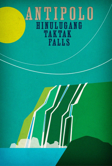
Tourism posters designed by Team Manila in 2011.
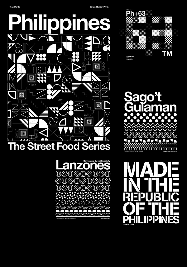
T-shirt designs made by Team Manila in 2014.
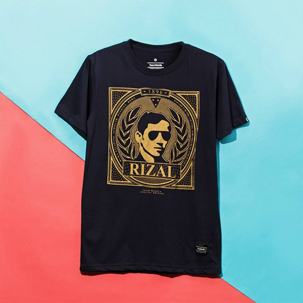
A T-shirt featuring Jose Rizal, released as part of Team Manila’s 2015 Independence Day Capsule Collection.

Image from the Philippine Department of Tourism’s 2012 “It’s More Fun in the Philippines” campaign.
Creative Mispronunciations
With its streetwear stencils and prominent use of Helvetica, Team Manila may not seem that groundbreaking when measured by a global standard of design style and discourse. However, international design movements tend to reach us with delay or in garbled form. They sometimes dribble in through returnee designers educated overseas, the Internet, and forward-thinking magazines bought while traveling, on Amazon, or at secondhand bookstores in Manila. When trends do arrive, we are faced with the added challenge of poor translation and, in the best cases, creative mispronunciation. Though somewhat tenuous, our connections to foreign movements are still important for Filipino designers to consider, as there is little local theory on which to base a critical perspective. We have to navigate with overseas currents, not merely for the sake of emulation but for crafting analyses fit to what’s happening on the ground.
In light of this, one might ask: Why was Helvetica, with its idealized geometries floating above pristine white fields, yoked to the Technicolor identity of the Philippines, where nothing is the color of snow (too much dust and smog), and the very notion of blankness seems utopian (too little empty space)? Filipino graphic design is as over-crowded as the landscape of our country, which has the region’s second-highest urban population density rate. Here, minimalism can be understood as a sign of poverty, only surfacing when the designer does not possess enough technical or financial prowess for the addition of borloloy (lavish ornamentation), and fills the gaps with decorations that cost time and signify money. A white void might also denote a spiritual lack. There is no greater Filipino sorrow than being alone, and the singular focus—the whiteness—of minimalism can hardly be sold to a people whose idea of visual pleasure is an explosion of the colors and textures that constitute the experience of community. To us, variety is necessary to attract the eye and soul. Universality in design is not about the blurring of all colors into white—a color we wear to funerals—but rather the representation of every facet of the community with its own distinct shade. The more flamboyant the better.
Team Manila’s use of sober-faced Helvetica to convey Filipino pride is all the more noteworthy in this context. “We chose the typeface for our logo even before we started making the shirts, because it was clean and clear,” Alviar continued. Helvetica was originally an attempt at typographic perfection through the crafting of ornament-free, minimal forms, which together could provide a universally accessible visual language. Symbolizing affective fervor for an equatorial nation may be far from the typeface’s original intent, but it’s rather fitting that Helvetica would come to represent the sentiment of a united people.
Of course, this sentiment is entirely nationalistic. Agency is only granted to graphic designers in the Philippines when nation-building is invoked. When political or social power is conceded to designers, it is still to serve top-down power structures and corporate interests (which is not to say that graphic design in the West does not serve top-down power structures and corporate interests, though the presence of a more developed critical voice can at least nominally call these practices into question). Here, design theory is almost invariably passed through a sieve that separates critical or subversive qualities. What trickles down to application is only the notion of agency as optimism, colored a particularly Filipino shade of happy, unadulterated by the analysis of weightier issues—without which, it would seem, change cannot occur. The current brand of Philippine nationalism tends to exalt only the positive traits of a people, and messages carried by design nationalism are unequivocally one-sided in their portrayal of the Philippines as the most awesome place ever. The notion of agency as an oppositional force is difficult for a people whose idea of power, enforced by a long history of both colonial and dictatorial social norms, is the ability to create consensus and harmony.

Billboards in Manila. Photo by Jeffrey Hannan.
PowerPoint Nation
In the Philippines, graphic designers often do not identify as such. They might be called print technicians, graphic artists, layout artists, or simply artists. Their work is less likely to entail the direction of a campaign from conception to execution than to serve as a cog in the wheel of a graphic-service provider employed to do precisely what a client dictates. Designers mostly operate within a larger manufacturer of tactile objects, executing preconceived or template-driven designs. (The exceptions are concentrated in large urban areas like Metro Manila or Cebu City, where a few Western-style studios have regular clients like ad agencies or medium-to-large corporations.) The street-level graphic designers are either precariously freelancing for pittances or working full-time but adjunct to some sort of printing service that makes books, tarpaulin billboards, corporate giveaways, illuminated signs, Xerox or Riso copies, silk-screened items, T-shirts, even tattoos. The key element for the success of these businesses is the ability to diversify, to act as a one-stop convenience (sari-sari) store for graphic artifacts.
The invisibility of graphic design as a legitimate profession, something you might earn a diploma in at school, means that the workforce is for the most part unspecialized and undereducated. Consequently, there is little respect for the designer’s input. It is common to see print-shop customers sit down and dictate the layout while the designer dutifully clicks in assent. What results is a nation full of graphics that resemble Microsoft Word or PowerPoint files, as that is generally the software literacy level of the client, who is always right. This attitude makes its way, largely intact, into the corporate world, judging by the typeface-blindness and kernel-deafness of so many corpo-conglomerate billboards.
Examining the class struggle between the moneyed, educated client and the undereducated, working-class designer, a vicious cycle becomes apparent. Because designers are usually considered to be blue-collar executors rather than creative-class visual strategists, clients do not listen. Because clients do not listen (or designers cannot speak), atrocities are committed on high-visibility design products such as billboards. Because major advertisers commit amateur design mistakes, including but not limited to irregular kerning, overly wide leading, typeface confusion, and the heavy-handed use of extreme drop shadow, smaller advertisers and designers believe that these things are normal, even desirable, and so design illiteracy is perpetuated. Because design illiteracy is so ubiquitous, there is hardly anyone able to teach design and specialize the workforce. Faced with extremely inferior salaries—the design of a logo can go for as little as three hundred pesos, or six US dollars, according to a freelance recruiter interviewed in 2015—and few opportunities for creative fulfillment, talented designers, most of whom are self-taught, emigrate to other countries in search of appreciation.
These practices and attitudes contradict the power of creative industries, of which press and literature form the largest part (both in terms of economic contribution and employment), according to the UNESCO Creative Economy Report of 2013. Creative industries in the Philippines employ 11 percent of all workers—the highest percentage in the world—and represent 5 percent of the GDP. The Filipino designer, then, does possess the potential to drive economic growth and attain social influence.

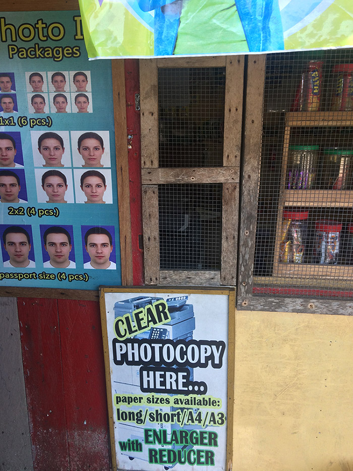
Handmade signage for a copy shop catering to elementary and high school students in Parañaque City.

Copy shops near Ermita Street in Manila. These shops often double as mini travel agencies, as the area is full of both tourists and overseas-employment agencies.

While this sign advertises large-format tarpaulin banners and panaflex signs, its stall is too tiny to house the equipment required for such services. The key to economic survival is to accept all kinds of orders, and figure out later how to get them done via outsourcing.
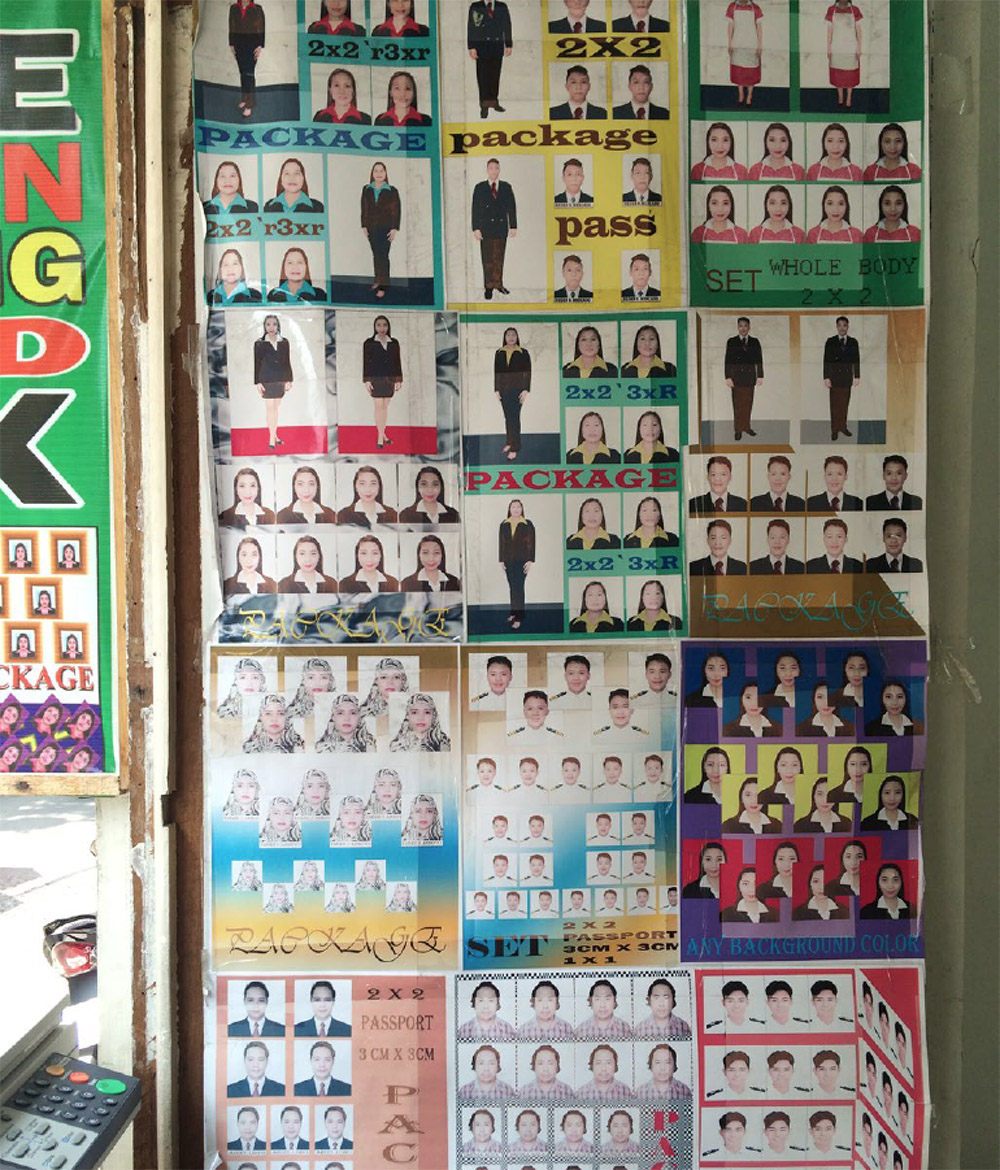
Offerings of a copy shop in a neighborhood with many overseas-employment agencies. Job applications to work abroad often require ID photographs in very specific formats. Applicants may be required to wear a seaman’s uniform, a maid’s uniform, or a jacket and tie in the photograph. Not all applicants have access to such attire, so copy shops offer to digitally add these outfits to any photograph.

Along a major highway on the island of Bohol, a sari-sari store serves as an internet cafe, copy shop and publishing “hauz.”
The sari-sari store owner transacts print-shop orders at this tiny window. Customers buy food or drinks at a separate window.
Political Giveaway Season
If you were to ask someone on the street to draw a line between institutional power and graphic design, she’d probably tell you—in saving-face, saying-without-saying Filipino style—that the political campaign season is the busiest of times for designers. The owner of a printing press might provide more sordid details about how the discounted, in some cases gratuitous printing of campaign collateral might win him favors, ranging from tax exemptions to the awarding of bids to produce all of the politician’s printed materials, should he or she be elected. A congressional aide might allude to political parties creating their own printing presses that operate exclusively during campaign season and serve to launder campaign money into political pockets. The manufacturer of corporate giveaways such as key chains, T-shirts, mugs, fans, or even leather wallets might mention that these products often seal the deal for voters, as the Filipino public does not always vote for convincing political platforms but rather makes decisions based on who hands out the best freebies. (A friend recounted a tricycle driver saying, “Whoever I vote for, it doesn’t make a difference to my life. At least with this guy, I got a leather wallet. What did the other guy give me? Nothing.”) A sign painter—arguably one of the most talented graphic designers, vernacular or otherwise, in the Philippines—might speak of a big boost in business in advance of elections, just before the moratorium on spending public funds is enforced, as he’s employed to paint the names of politicians on all kinds of surfaces in public space.2
Everyone in the business would point to a common political campaign practice: outsourcing the design to printers (which is to say regular and not fancy designers), in most cases with very basic instructions: “Here’s the politician’s name, here’s a picture of her face. I don’t really care what else you do, but we want both of these things to be really big.” In which case, the role of designer, however condescended to, is quite weighty.

A roadside stall where bus and jeepney drivers purchase hand-painted signs indicating key points on their route. Smaller signs cost around twenty pesos, or forty-three cents.

Larger signs might cost anywhere between one hundred and two hundred pesos, depending on the inks used. Fluorescent inks or tape typography are generally more expensive.

A sign painter shows stroke manuals commissioned for the Office of Culture and Design’s publication Filipino Folk Foundry.

A customer dictates the design for a tarpaulin sign at a print shop in Parañaque City. Designs are often made using PowerPoint, Word, CorelDRAW, MS Paint or, in the fanciest of cases, Photoshop.

Campaign collateral generated by print shops during election season.

An example of “epal” tactics, wherein a politician in office will brand public-works projects as a personal initiative. Other tactics include painting walls, road blocks, and other infrastructure the colors of one's political party, thereby branding the entire neighborhood.

Politicians take advantage of fiesta dates (holiday festivities usually scheduled on the feast day of an area’s patron saint) to put up tarpaulin signs with their names and faces. Erected throughout the year, these “public service announcements” are most aggressively posted before election season begins to get around restrictions on premature campaigning.
World-Class Faux Coconuts
Between 1965 and 1986, the ruling period of conjugal dictators Ferdinand and Imelda Marcos, design and culture were mobilized to foster a mythical, ultranationalist image of a Filipino nation reborn after nearly fifty years of American rule and two-odd decades of post-WWII malaise. This epic campaign for the Marcos brand, christened Bagong Lipunan (New Society), was compartmentalized into a male-female distribution of tasks. While Ferdinand busied himself with the masculinized endeavors of infrastructural investment, governmental policy, and cronyist economic relations, Imelda engaged her female wiles in providing a glittering, showbiz-like new facade for the nation, instrumentalizing native iconography and folklore in a process of “modernization.” To this end, the presidential couple was consciously refashioned into the nation’s Adam and Eve. They positioned themselves as protagonists of the local legend Malakas at Maganda (Strong and Beautiful): the Filipino first man and woman, born from a single cane of bamboo. Design and culture were accordingly oriented around the artificial rebirth of an idealized and mythical nationhood. For the Marcoses, this identity had to be “world class,” as Filipinos describe any product or person that is so top-notch as to be exportable. Large-scale urban developments and monuments, such as Leandro Locsin’s Brutalist Cultural Center of the Philippines—inspired abstractly by the bahay kubo, or traditional bamboo hut—dramatized the godlike role of the Marcoses in the construction of a new Filipino identity: Orientalized and vaguely folkloric but designed expressly for global consumption.
In order to fully implement the New Society campaign, Imelda and Ferdinand sought to control information that reached the public through all media outlets. For writers, filmmakers, designers, and image-makers unwilling to be manipulated, finding meaningful and remunerative work was difficult. Those who opposed the myth-making apparatus were persecuted, tortured, imprisoned, executed, or exiled. While rare, independent publishing outside of Imeldifically blessed outlets did happen occasionally, creating small pockets of creative expression and subversion. One such place was the cultural publication Ermita, which published ten issues in 1976, four years after the pronunciation of martial law and ten years before the end of the Marcos era and its stifling censorship. Another was Jingle Chordbook, which was published from 1970 to 2012. While the publication also featured record reviews and artist profiles, Jingle was most loved for its extensive section of pop-song chords and lyrics. Juaniyo Arcellana, now a senior desk editor for the Philippine Star, one of the country’s largest daily newspapers, wrote for Jingle over many years. He recently recounted that tumultuous early era over beers.
Back then, there was no free press and only three state-sanctioned newspapers: the Daily Express, Manila Bulletin, and Times Journal, and they all practically had the same news, just minor variations. There was also The Manila Review. It wasn’t exactly a Marcos publication, it didn’t parrot propaganda, but it was still published by the government. A lot of the artists and writers either took to the mountains [as part of the communist guerrilla group, the New People’s Army (NPA)] or were imprisoned. I worked at Jingle, alongside very talented people like Dante Perez and Lav Diaz, who now are big deals in the art world. There were so few publications, all of us ended up working in the same places. When I saw Ermita magazine, when my father brought home that first copy for me, it blew my mind. We became inseparable. I used to read it before going to bed, I used to smell the newsprint. Ermita addressed the real need for an outlet for all the artists and writers whose activity was abruptly stopped during Martial Law.
With editors Krip Yuson and Sylvia Mayuga and art director Boy Yñiguez at the helm, the pages of Ermita were populated by cultural heavy hitters such as filmmaker Peque Gallaga; graphic designer, artist, and curator Ray Albano; and artists Roberto Chabet and BenCab. Though the magazine was primarily devoted to art and culture, it agitated for political change in its own subtle way. “Di pwedeng deretsohan lagi, parang padaplis” (You couldn’t always say things straight, it had to be sideways), Arcellana finished. The Marcos aesthetic was all about clean lines, noble values, and neatly packaged, linear narratives. Organic and irreverent, these magazines carried hidden messages in cryptic typefaces, advocated rebellion through sex and drugs and raucous misbehavior, coded their real opinions in cleverly juxtaposed items of news, and used humor as a weapon to undercut official agendas. The humor was crude at times. See the issue of Ermita with the provocatively titled travel feature “69 Philippine Beach Resorts,” which juxtaposes an image of a bikini-clad babe—perhaps a nod to the sex tourism industry?—with that of a typically modest swimming-in-shorts-and-T-shirt crowd, along with a list of government-sanctioned tourist information concerning entrance fees and facilities. Ticking the necessary boxes, they published the government’s information, but with tongue decidedly in cheek. Sometimes, the criticism was open, albeit in very fine print, like the August edition’s “Cityscapes Citations” piece, in which the editors asked people to contribute “tiny” public victories they saw within Manila’s landscape. While one tacitly understood that these victories were attacks on the Marcos chokehold on the city’s appearance, a not-so-veiled denunciation could also be read on the title page, in small black font that did not quite contrast with the bluish background.
Over the years, our aging city of Manila has been the object of numerous at-tempts at refurbishment and beautification … some rather pathetic in their intent to replace what would be better left alone or whitewash what would be better demolished.
The miniature text fired against Imelda’s “city beautification” practices, which included, as Gerard Lico details in Edifice Complex: Power, Myth, and Marcos State Architecture (2003), erecting whitewashed walls to cover shantytowns from the view of passing motorists (a move still used aped by politicians today, especially when important international dignitaries come to visit), spray-painting parched lawns and dried fronds a more attractive shade of green, and tying faux coconuts around fruitless trees for a more rustic effect.
As the dictatorial regime employed design to fabricate its oppressive nation, the graphic subversions of magazines like Ermita helped foment the spirit of civil disobedience that ultimately led to the Marcos-toppling EDSA Revolution of 1986, which saw citizens of Manila storm the city’s main thoroughfare, Epifanio de los Santos Avenue, in protest of the assassination of opposition politician and vocal Marcos detractor Ninoy Aquino. Ermita folded for financial reasons, but Jingle persisted until online chord archives and public TV karaoke channels rendered its formula obsolete. Up until the last issue, Jingle continued to publish songs that had sound-tracked the EDSA revolution, their chords and lyrics constituting an important memorial to the fight for freedom.
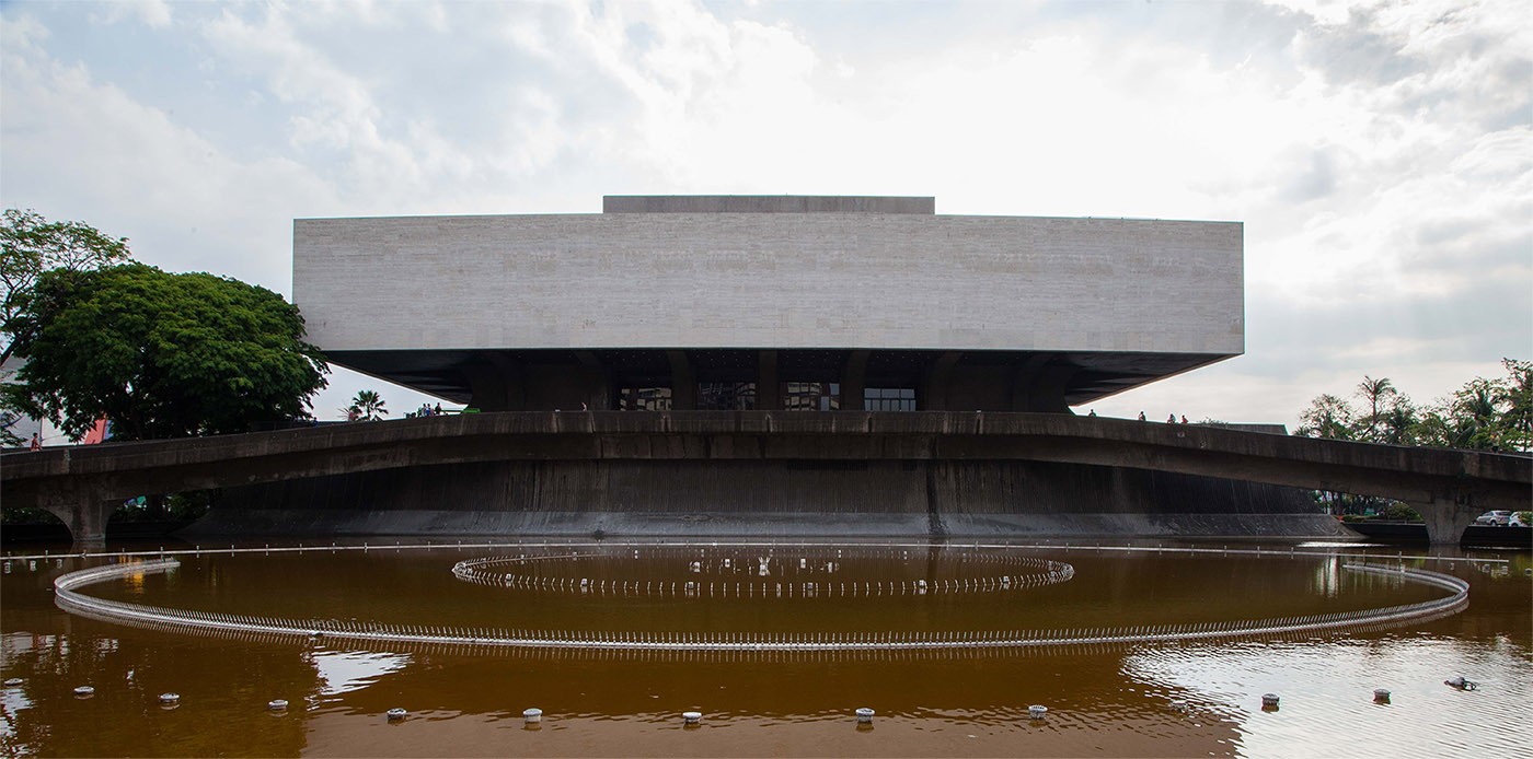
The Cultural Center of the Philippines in Manila. Photo by Tammy David.
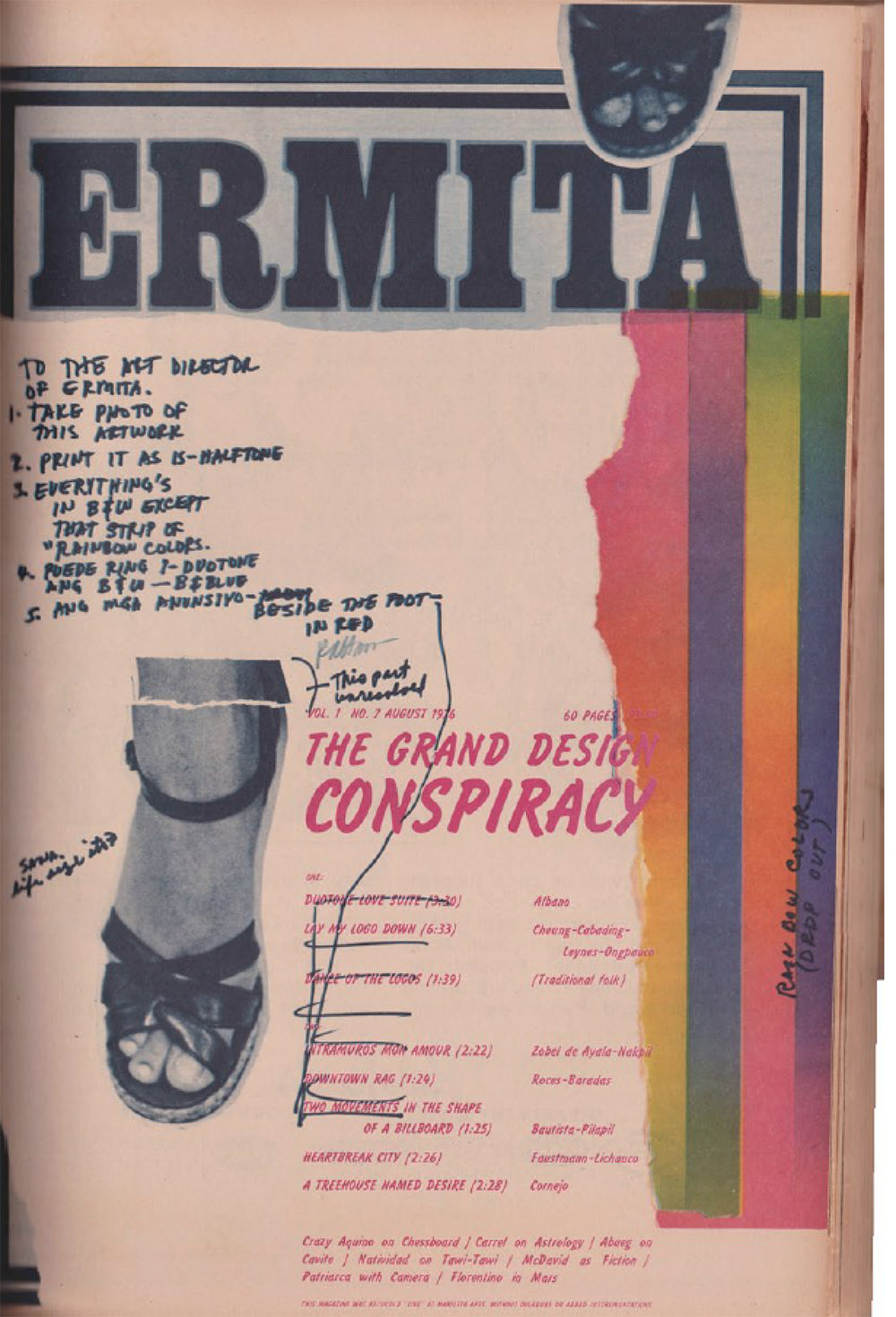
Issues of Ermita.

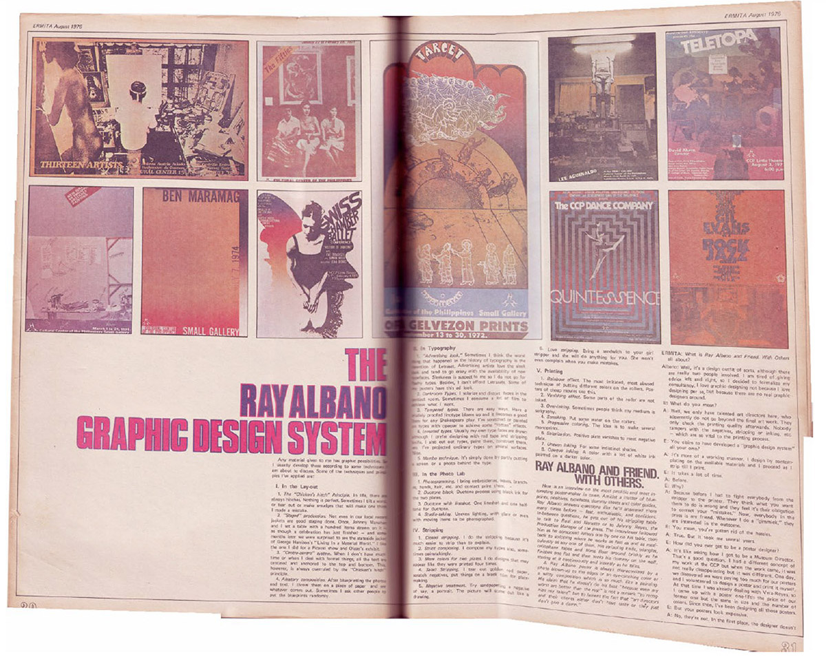
An article by Ray Albano describing the techniques and principles of his graphic design work, featured in the seventh issue of Ermita.
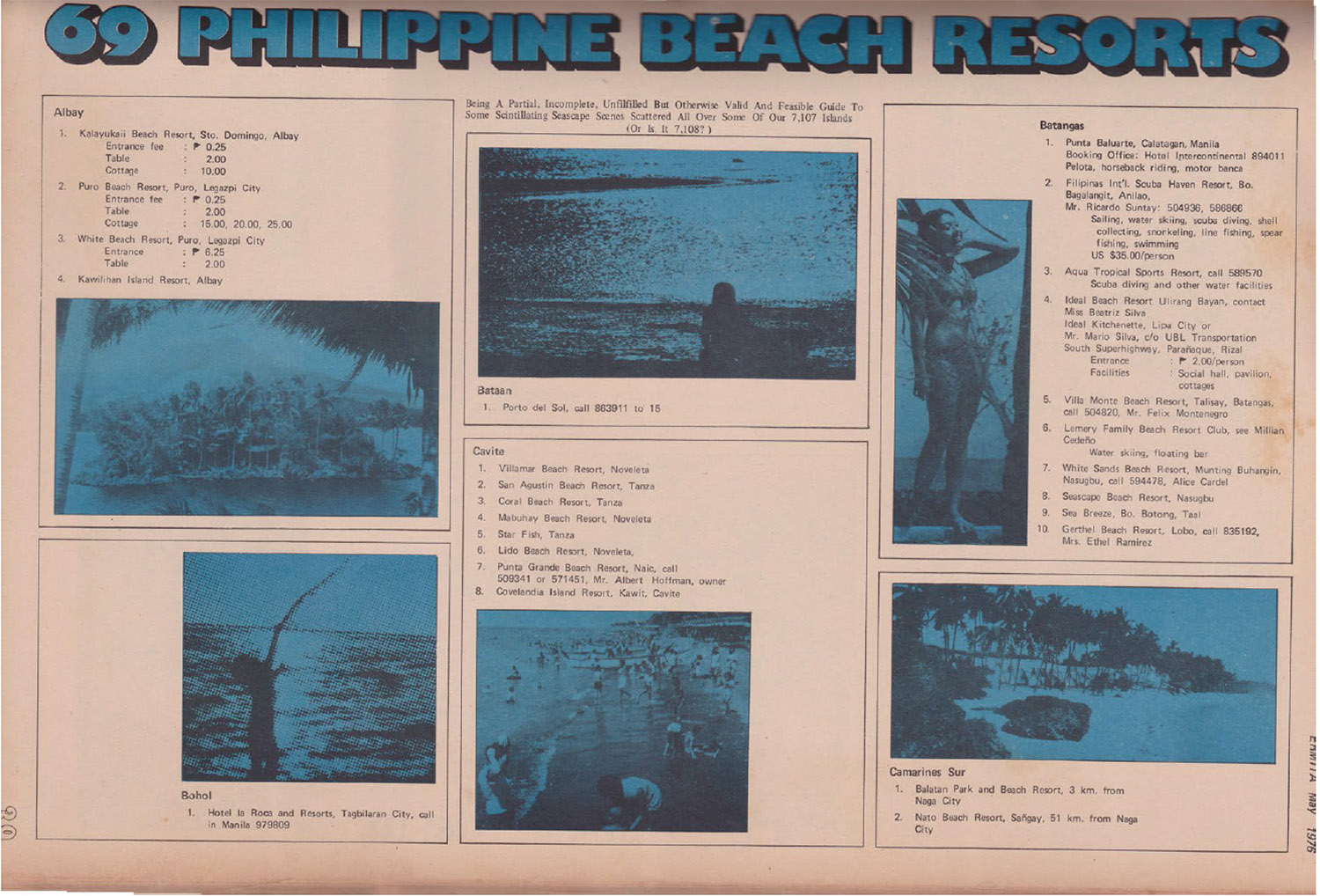
“69 Philippine Beach Resorts,” from the fifth issue of Ermita.
Mistranslation of the Western ideal:
the long
white arms of Tumblr,
Pinterest,
Etsy,
and Instagram.
The undervalued
vernacular designer,
and how the appropriation
of his craft, turned
#trendingtopic
without
memory,
may sterilize
his spirit.
The Philippine designer
and social media and the Internet.
“Wael Ghonim, Google’s Egyptian executive,
said: ‘If you want to liberate a
society just give them
the Internet.’”
1 Marketing speak in the Philippines classifies people into ranks of A, B, C, D and E. A-B is upper and high-middle class and C-D-E is lower-middle class, low income, and poor.
2 Popularly known as epal, this practice increases name recognition for candidates—another surefire way to win elections. While it is frowned upon, epal-izing is still prevalent due to Filipino politicians’ notorious impunity. Several bills have been filed in the Philippines to curb these practices, reflecting, per the Senate Anti-Signage of Public Works Bill 1976 (which has not yet been passed), the public distaste for “a system [that] fosters and promotes a culture of political patronage and corruption, and diminishes the importance that the public needs to place on sup-porting government officials, not because of their popularity, but because of their essential role in policy determination.”