
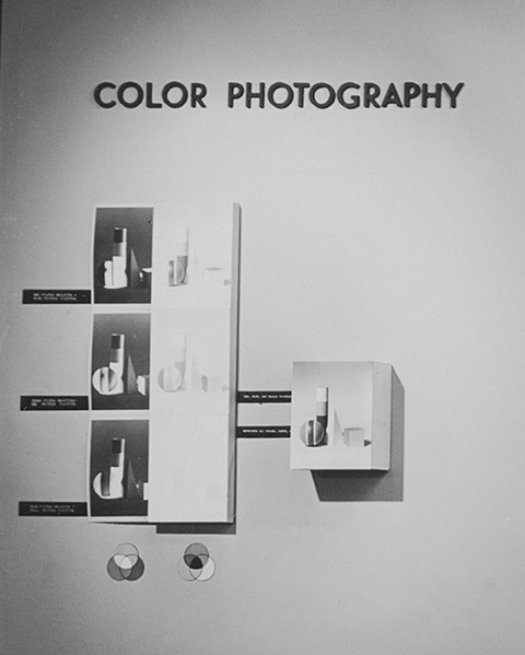
Installation view of the exhibition “Color Photography,” May 9–July 4, 1950, the Museum of Modern Art, New York. Photographic Archive, the Museum of Modern Art Archives, New York, NY. Photo: Soichi Sunami. Digital image © The Museum of Modern Art/Licensed by SCALA/Art Resource, NY.

William Eggleston, Black Bayou Plantation, near Glendora, Mississippi, c. 1969–70. Janet Malcolm wrote in the October 10, 1977, issue of the New Yorker that the image captures “one of those heart-catchingly lucid days of blue sky and fast-moving clouds, of juicy, fragrant greenness, of shivering tree leaves showing their white undersides—a day that looks, one says to oneself, like a Kodacolor snapshot, but that, conversely, a Kodacolor snapshot never evokes.”

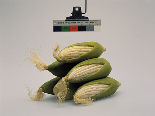


Clockwise from upper left: still from Harun Farocki’s Stilleben (Still Life), 1997, 16mm, color, 56 minutes; Christopher Williams, Kodak Three Point Reflection Guide, © 1968 Eastman Kodak Company, 1968. (Corn) Douglas M. Parker Studio, Glendale, California, April 17, 2003, 2003; Roe Ethridge, Thanksgiving 1984, 2009; cover of Dieter Roth’s Copley Book, 1965; Sara Cwynar, Girl from Contact Sheet (Darkroom Manuals), 2013.


A selection of well-known images used for compression or duplication testing. Clockwise from upper left: “The Cameraman,” a 256x256 grayscale compression-algorithm test image developed at MIT, whose Great Dome is visible in the background; “Lenna,” a compression-algorithm test image scanned from a 1972 issue of Playboy, featuring Swedish model Lena Söderberg; grayscale test image of a U-2 airplane covered with United States Air Force resolution targets from the University of Southern California Signal and Image Processing Institute; an Eastman Kodak “Shirley” image for testing the color balance of photo-printing machines; a “China Girl” or “leader lady” used to assess motion-picture prints, courtesy of the Northwest Chicago Film Society.
So Perfect an Apparatus
On a warm spring evening in early May, 1950, Edward Steichen, the director of the Department of Photography at the Museum of Modern Art in New York, opened an exhibition touted as a milestone event: the museum’s first exhibition devoted solely to color photography—titled, authoritatively, “Color Photography.” It featured an extravagant profusion of photographs drawn from science, journalism, and commerce: a microscope picture of an amoeba; an aerial photo taken from a rocket launched over the White Sands missile facility in New Mexico; Life’s images of exploding atomic bombs and the first published color photo of Mars; tear-sheets from the pages of Vogue, Fortune, Ladies’ Home Journal, and other popular magazines. The varied list of photographers included Roman Vishniac, Paul Outerbridge, Eliot Porter, Weegee, Irving Penn, Richard Avedon, Louise Dahl-Wolfe, Horst P. Horst, and Steichen himself.
The abundance of imagery on display served Steichen’s curatorial aim: to probe whether this technology could be a “new” and “creative” medium for the artist, and not just a “means of supplementing or elaborating the recognized attainments of black and white photography.” Chronologically, the show’s earliest works were printed reproductions of Autochromes, the colored-starch glass plates patented by the Lumière Brothers in 1904, marking that invention as the inauguration of modern color photography. But chronology didn’t guide the exhibition: the physical layout was determined by image source (e.g., the military, the magazine) and display needs of various media, particularly the many color transparencies, which had to be lit from behind in darkened rooms.
While it may seem surprising that a museum devoted to modernism would present a hodgepodge of primarily commercial and scientific images, Steichen wanted viewers to consider color photography in relation to the “unconscious conditioning firmly established by the black and white photograph,” and so included virtually no abstract work.1 He hoped the exhibition would explore color’s artistic potential, but acknowledged that the question of its value was still unanswerable, concluding the press release by saying that “in spite of … rich promise, color photography as a medium for the artist is still something of a riddle.” The reviewer for the Times noted that the show had a feeling of “indecision,” as though Steichen himself didn’t quite know what to make of the work. Others had no such uncertainty: German art historian Willi Wolfradt disdainfully wrote that “the automatic recording of ‘natural colors’ with so perfect an apparatus should actually have no claim to be represented in rooms devoted to creative pictorial art.”
Steichen’s inaugural all-color photography show has been all but forgotten; popular belief erroneously holds that MoMA’s first color photography exhibition was of William Eggleston’s work, in 1976, curated by Steichen’s successor, John Szarkowski.2 More than a quarter-century after Steichen tentatively asked how the artist might employ color photography, Eggleston’s reply caused a sensation—in fact, a furor. His saturated quotidian scenes—of suburban homes, painted ceilings, plastic bottles spread across a dirt road—looked rather like “Kodacolor snapshot[s],” as Janet Malcolm wrote in the New Yorker. Malcolm noted that color photography’s new status as an “advanced form” was particularly surprising given that color work had previously been “associated with photography’s most retrograde applications—advertising, fashion, National Geographic-type travel pictures, nature pictures”—the very categories Steichen had presented in his inaugural color show. In William Eggleston’s Guide, the catalogue for the 1976 show, Szarkowski lauded Eggleston’s work as “perfect,” in part because, unlike previous color photographers, he integrated the formal properties of color with its content, working “as though the world itself existed in color, as though the blue and the sky were one thing.” Eggleston used color in “more than descriptive or decorative” ways, Szarkowski claimed. Yet the majority of critics assessed Eggleston’s color with adjectives of loathing. Vulgar. Kitschy. Tacky. Banal.
In the responses to these two exhibitions, one can discern the tensions that characterized color photography’s early reception more generally. Critics lamented either a realism that seemed too automatic or a chromatic intensity that seemed too coarse. The former invalidated the artistry of the photographer, since a “perfect apparatus” leaves no room for creative authorial intention, while the latter devalued the accuracy that was photography’s hallmark, and suggested either the amateurism of the vernacular snapshot or the garishness of the mass-reproduced ad. On the one hand, it was too real; on the other, too fake.
Since the 1970s, color photography has entirely saturated the visual landscape: the clean white spaces of contemporary art, the pages of magazines, the screens of computers and handheld devices. The question of the relative vulgarity of the medium seems rather quaint, since theoretical discourses have shifted from concerns about photography’s vaunted “indexicality,” its purported objectivity, its visual codes, to matters of identity construction, surveillance, representational politics, and forensics. Of course, one of the most typical contemporary experiences of color photography is that of an electronic, networked stream of images, in which any attachment to naturalism is unimportant. We have the tools to edit, alter, and disseminate our images with a push of the fingertip; the “filtered” state of so many social-media images now goes unremarked. The chromatic styles or moody palls of these looks are temporary effects, aesthetic skins that images can inhabit or shed.
Such looks in photography have always been constructed: “Vulgar,” “natural,” or “perfect” photographic color arises from the convergence of industry, science, and consumer preference. Kodak, for instance, “manipulates reality in a different way than Agfa,” the media philosopher Vilém Flusser points out in “How Should Photographs Be Deciphered?” (1981). This is not unexpected, since the value of a film’s brand has to do with differentiation, and companies like Kodak made fortunes from chromatically notable films. But how were their “manipulations” engineered? Behind the pictures we see lies another class of pictures: those used to test how photographs will appear as they undergo processing, development, or duplication. As a category, these reference images are meant to encompass a majority of typical photographic scenarios: the portrait, the landscape, the still life; the aerial shot, the textured close-up, the resolution detail.
Some reference images have gained a sort of cult fame, particularly certain portraits—the China Girls on the leaders of motion pictures; the Shirleys of the print-processing lab; Lenna, a favorite of scientists testing compression-algorithms—not least for the uncomfortably normative ideals that they replicate: that anodyne smile, for instance, of the anonymous Caucasian female.3 And the optical targets, color swatches, channel glitches, and stock genres that signify industrial image production have in turn been seized upon by artists to expose the medium’s technical seams, its apparatus—a gesture as old as the avant-garde itself. It’s become a stock move to use stock images: Their genericness, and our attendant discomfort with the notion that experience or appearance can so readily be distilled into the “typical,” provides a ready-made index of societal codes; while the inclusion of the technical marks of production points to the status of images as commodities. A parallel effort in critical discourse is to nod toward the “production, circulation, and consumption” of images, a rhetorical trope that has itself, by now, become functionally stock. But such invocations of the technical elements of the contemporary image world—the endless pictures made and devoured by far-flung eyes and hands and machines—tend to function primarily as tokens for the apparatus, flattened symbols of the larger structure. These materials are rarely examined for the actual work they perform.
This isn’t surprising. “The relation between a photograph and what it represents is curiously opaque,” as Flusser notes, since it’s almost impossible to represent the process that mediates between a photograph’s input (the world) and output (a picture). It’s too “difficult to pierce” the camera and its internal programs; we cannot see, literally or metaphorically, inside that black box, nor can most of us understand the methods that regulate how images appear on screens or printed pages. But now the apparatus of image-making has been revealed so many times that the revelation has become its own generic fetish, without dislodging the supremacy of image culture in any way. We should perhaps ask: Is there something more specific that standard reference images can tell us? What do they say, exactly, about how we want pictures to look? Whose preferences do they index, and when were those preferences lodged? If they work to deliver the images we want to see, how, in turn, do those images work on us?

Eastman Kodak scene-library reference image, circa mid-1980s. To assemble the scene library, which began in 1975, photographers for Eastman Kodak Research Laboratories captured reference images on large format (4x5") film, which were then digitized using a high-resolution microdensitometer. The resulting data were processed for use as standard scenes for the digital simulation of photographic products in development. This image is the property of Eastman Kodak Co. or its successors.


Above and right: Eastman Kodak scene-library reference images, circa mid-1980s. These images are the property of Eastman Kodak Co. or its successors.

Advertisement for Kodachrome II color film, featuring “blazing scarlets, lush greens, [and] tart yellows,” as shown by the fruits in the still life. Back-cover ad of the March 1962 issue of U.S. Camera, “America’s Leading Photographic Magazine.”

Advertisement for Anscochrome color film. The copy highlights the film’s “exciting creative color” and its ability “to record deep rich textures and bright highlights without losing detail or distorting color values.” Inside-cover ad from the 1960 issue of Color Photography, an annual publication of Popular Photography magazine inaugurated in 1956.
The Saturated World
If, in the arc of color photography’s widening reach, MoMA can be taken as a metonym for the American high-cultural landscape, its democratic counterpart in industry can only be the Eastman Kodak Company, the technological giant at the heart of twentieth-century imaging, headquartered in Rochester, New York. Rochester is also the setting for a rather unusual photograph depicting a perfect day for a picnic with old friends: the grass eye-poppingly lush, the sky a cloudless blue. In the photo, smiling couples beam around an array of common brands of packaged food: Wise Ridgies, Pringles, cans of Slice and Coca-Cola.
The picture seems somewhat unreal because it is, because it depicts a picnic that never quite occurred, a picnic to represent all picnics; the sky is the ideal sky, the green grass the perfect stand-in for all lawns. Created for Eastman Kodak’s Research Laboratories, the photograph is part of the company’s “scene library,” a collection of reference images of archetypal subjects, loaded with familiar subject matter and colors: an outdoor wedding portrait, a young girl at her birthday party, a touristic cityscape. Such images have been one of the chief means of evaluating the aesthetic merits of photographic products in development.
Kodak’s researchers began to assemble this library of reference photos in 1975, in the face of threats to its market dominance, to use in tests meant to discern the preferences of its consumers so that it could create the best, most pleasing new films (for amateurs and professionals alike) as quickly and cheaply as possible. To produce images for the library, research staff photographers would shoot a particular scene first with the subject alone and then with various calibration devices—such as color-bar cards and resolution graphics—visible, so as to create both naturalistic and technically informative versions of the same image. After processing the scene-library images in various ways, altering them to display particular qualities of color, contrast, subtlety of tone, and resolution, Kodak’s imaging scientists would generate sequences or pairs of the manipulated images and distribute them for opinion polling with photographers. A division at Eastman Kodak called Human Factors carefully devised questions that outside market-research firms would ask in their consumer interviews, queries like: Which of these photographs seems more representative to you? Which has the optimal color? Which of these images do you prefer?
Interviewers at polling stations in malls and other locations around the US and overseas would invite consumers to examine images in return for a modest fee or token gift. Certain predilections became clear: Almost all viewers preferred films with finer grain structures. Caucasians tended to prefer skin that appeared tanner in reproduction than in reality, although opinion varied slightly according to region; for example, those on the West Coast generally preferred rosier skin tones. At different times of year, test subjects often selected somewhat different balances of warm and cool colors. They were also picky about the hue of the sky at the horizon; when shown a pair of photographs, one with an accurately reproduced horizon—in which the color might be almost white, due to a high degree of light-scattering by the atmosphere—and one with a horizon nearly as saturated with blue as the sky overhead, consumers reported that the latter “looked right.” The strongest, most consistent finding among all subjects was a strong preference for bright, snappy versions of well-known colors, with saturations far exceeding their actual colorimetric values.
None of this was any surprise to Kodak, where photographic researchers had been studying such preferences for a number of years. As Kodak researcher C. James Bartleson explained in 1960, in his foundational essay “Memory Colors of Familiar Objects,” skin, grass, sky, and other “objects with which we have frequent visual experience” are indelibly imprinted in our memory. Memory colors are hues that we can recall easily, and thus they would seem to provide the imaging industry with a straightforward heuristic for judging accuracy; for example, slight hue shifts toward green or purple in the familiar color of flesh are immediately detectable to the human eye. But Bartleson found that test subjects consistently remembered the saturation of familiar colors with exaggerated intensity, or to be “more characteristic of the dominant chromatic attribute of the object in question.” In other words, “grass was more green, bricks more red.” Rather than increasing accuracy, our familiarity breeds a kind of mnemonic distortion. And because most people consider themselves quite capable of judging the colors in photographs “taken by people other than themselves, of objects that they have never seen, at times when they were not present,” as the scientist R. W. G. Hunt puts it, the crucial industrial mandate in photographic color reproduction is accordance with memory, not reality. Thus the technologies that record our memories have been materially imbued with memory’s subtle alterations.


Left: Philipp Otto Runge’s Farbenkugel (Color sphere), 1810. Center: Johannes Itten’s Farbkugel bandraumlich (Color-band sphere), c. 1919–20. Right: Color sphere illustration from frontispiece of Albert Munsell’s 1905 publication A Color Notation.

Diagram of John Guild’s trichromatic colorimeter, as it appears in “The Colorimetric Properties of the Spectrum,” Philosophical Transactions of the Royal Society of London. Series A, Containing Papers of a Mathematical or Physical Character, no. 230 (1932).
A: colorimeter
B: forty-watt automobile headlight lamp
C: focusing lens
D: prism
E: constant deviation monochromator
F: second monochromator
G: lens-rotating motor
H: gas-filled lamp
I: liquid filter
J: white diffusing surface

Two-dimensional representation of CIE Standard Observer–derived color data, the CIE x, y chromaticity diagram, in which the coordinates define the qualities of a color stimulus (apart from its luminance). The coordinates of all physically realizable color stimuli lie within the horseshoe-shaped outline and the straight boundary at the bottom.
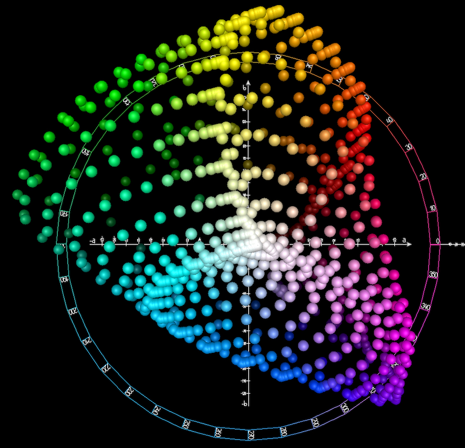
Three-dimensional representation of CIE LAB space, a mathematical transform of the 1931 Standard Observer data, viewed from above. CIE LAB and other Standard Observer–derived color spaces are important computational tools in the digital encoding of color images.
Other Human Factors
To conclusively find, as Bartleson did in his study, that memory distorts the appearance of color requires an objective system for measuring color in the first place. But how can this highly subjective experience of perception be quantified? From a philosophical standpoint, the question has long been vexed: “The sensations of another will be for us a world eternally closed,” writes Henri Poincaré, the French philosopher and scientist, in The Value of Science (1905). “[Whether] the sensation that I call red is the same as that which my neighbor calls red, we have no way of verifying.” Throughout the nineteenth century, scientific study of the physiological traits of human vision had intensified, but so did perplexity over the quirks of perception. The German physiologist Ewald Hering, for example, noted in Outlines of a Theory of the Light Sense (1905–11) that humans “see the paper of a book as white and the letters black at every convenient reading illumination,” whether we are reading “under blue or gray sky, or under the green arbor roof, or in daylight, gaslight, electric arc light, or incandescent light”—a phenomenon that came to be known as “color constancy” in the field of psychophysics.
In the nineteenth and early twentieth century, debates about the maddeningly slippery nature of color perception were often superseded, in the sciences, by the more practical concern of industry: finding ways to consistently measure the color of products. Color had once been physically precious, a product of rare minerals, barks, roots, and invertebrates, but in the eighteenth and nineteenth centuries it had become a more widely available commodity, thanks to the advent of synthetic and chemical techniques. Textile dyers, paint manufacturers, printers, and ceramicists were equally consumed with the question of how to standardize their products, how to ensure that dyes and textiles, inks and books, would always look the same from batch to batch. Numerous models for mapping out combinations of hue, saturation, and brightness had already been proposed by theorists and artists such as Johannes Itten, Philipp Otto Runge, and Albert Munsell, who plotted those variables onto orderly spheres or irregular solids, and schematized them in elegant, confectionary-hued illustrations. But industrial applications of such systems depended on the ability to compare a product by visually matching it with standardized sample colors. These systems had to use a pair of actual human eyes, for no quantitative model of the human visual response to color existed—until well into the twentieth century, when international trade finally made such a model increasingly necessary for consistency in textiles and paints, for the safe movement of trains and automobiles, for the regulation of gas lamps and lightbulbs.4
To normalize color stimulus for computation, scientists needed a theoretical set of eyes, a “standard observer”—an idealized viewer, the result of mathematical averages, whose perception could stand for all human vision. In 1926, John Guild, an optical scientist working at England’s National Physical Laboratory, set upon this task. Guild designed an apparatus that allowed test subjects to combine three colored lights, called primaries, in order to match a series of monochromatic test colors. To form the primaries, he affixed red, green, and blue filters with exactly defined wavelengths over illuminated lenses, which shone colored light into half of a divided box that formed the viewing chamber. (Guild chose the colored filters with mass production in mind, “so that the great majority of colors met with in industry and commerce can be matched by some blend of the three primaries.”) He then sequentially projected monochromatic test colors into the other half, so that both colors could be seen simultaneously through a small aperture. He asked his subjects—six men and one woman, all young, most recruited from the optics division of the lab—to adjust three knobs, each linked to one of the three primary colors, until they were able to match the test color.
By manually mixing measured intensities of the three colored lights, the subjects provided Guild with data that allowed him to determine the amounts of each primary required to match each tested wavelength of light. Guild did not initially publish his findings, due to the tiny sample size. But two years later another optical scientist, William David Wright, conducted a similar experiment with ten additional test subjects, which confirmed Guild’s findings. Guild decided that the two experimental data sets were sufficient, and in 1931 he presented a unified version to the Royal Society and then to the Commission Internationale de l’Éclairage (CIE), the international group concerned with light and color standards. Guild’s and Wright’s data entered the pantheon of standards as the CIE Standard Colorimetric Observer—the first mathematical definition of the responses of the human eye, born from the sight of just seventeen young Britons.
The Standard Observer allowed scientists to predict how the human eye would respond to wavelength stimuli, and thus how the appearance of colors may shift under different sources of illumination—and, crucially, how the human perception of colors may differ from what is “seen” by electronic sensors or film. This model would ultimately become an important tool in determining how color images should replicate—on paper, televisions, electronic displays, projectors—through the use of Standard Observer–derived color spaces, which serve as crucial computational tools for the digital-encoding process. But while the 1931 data set represents the physiological reactions of the human eye, measurement techniques did not fully solve the question of how to capture the world in color images—how to grapple with the world as it appears and as we perceive it, or want to perceive it. To make images pleasing to humans still requires humans to say what pleases them.

Digital photograph of a “box scene,” circa the early 1990s, utilized by the Eastman Kodak Research Laboratories for the testing of photographic film and digital cameras in development. The still-life box scenes contained objects with characteristics (e.g., color, texture, detail) useful for testing the performance of photographic products. The objects were arranged, fixed in place, and stored in a box with removable sides and top, and positioned in front of a backdrop when photographed. This image is the property of Eastman Kodak Co. or its successors.

Digital photograph of a “box scene,” circa the early 1990s, utilized by the Eastman Kodak Research Laboratories. This image is the property of Eastman Kodak Co. or its successors.


Assortment of “studio scenes” used in digital camera testing and review. Clockwise from above: studio test scene from Ephotozine.com; studio test scene from Imaging-resource.com; studio test scene from Digitalcamerainfo.com.
The Real Sky, the Preferred Sky
A specific manipulation inheres in the work of imaging scientists. A photograph inevitably contains less information than what it records, in part because the dynamic range (the range of gradations between the brightest light and the deepest dark) and color gamut (the range of available colors) in a given “live” scene can significantly exceed what can be displayed in a typical photographic medium. Edward J. Giorgianni, an imaging scientist who worked for four decades at Eastman Kodak’s Research Laboratories, compares the process of transposing the colors of reality into a photograph to “trying to stuff a large object into a much smaller box.” Imaging scientists must repeatedly tackle the question: Where can you sensibly compress or even lose information without it being obvious or objectionable to the human eye?
Generally, scientists engineer color images so that the brightest highlights and deepest darks are compressed, and a fuller set of gradations in the middle tones are maintained. Specific hues must accord with memory colors—a tomato must be properly red, a Caucasian face satisfyingly tan, a sky suitably blue—but not seem exaggerated or unbelievable. Imaging scientists refer to this mandate to generate color that is perceptually enhanced yet still acceptably faithful to reality as “the naturalness constraint.” When Kodak’s market researchers asked test subjects, “Which image do you prefer?” they were parsing, among other things, relationships between part and whole, determining whether the detail of a shadow on a figure or the saturation of grass made sense within the array of overall color and tone gradations in a picture. Different kinds of film were engineered to respond to light in specific ways—to privilege skin tones in portrait films, or to balance for tungsten lightbulbs or bright sunlight, for example. But all such film products were subject to the demand for color shifts that reflected memories and preferences.
This alteration of captured scene information is called rendering: After sensitized film or an electronic sensor has “counted” photons by reacting to them, the work of an image scientist is to determine the subsequent transformation that will amplify certain quantities of counted photons and minimize others in order to form a satisfying image—one that is both visually pleasing and convincingly accurate.5 An unrendered color photo would appear pale, almost ghostly—nothing like normal human vision—because it represents only what is captured by the sensitivities of the image-capturing device, rather than the perceptions formed by human sight. Color rendering in photography must therefore translate what chemical film or an electronic sensor “sees” in order to emulate what the human eye perceives, and what the human mind subsequently interprets. This process, whether undertaken through chemical reactions or by electronic signal processing, is highly engineered and nonlinear: What goes in does not have a one-to-one relationship with what comes out.6
Kodak had been fine-tuning color renderings for decades: For every new film product in development, researchers had to physically produce possible color effects with experimental emulsion coatings—a lengthy, expensive process. The establishment of the scene library in 1975, along with advances in computing power, changed all that. The analog photos commissioned for testing were optically digitized and processed by what was then a state-of-the-art computer in a new initiative called “image simulation.” For the first time, imaging scientists were able to mathematically model and produce images that realistically simulated the changes they hoped to achieve, at a later stage, by manipulating the chemical reactions of analog film. An analog scene-library image could, via a series of algorithms that reverse-engineered the effects of chemical development, be computed back to its latent image: the photograph as a quantity of photons, as pure information. This information was then processed in various ways to simulate the proposed qualities of a new analog film. Instead of making complicated, experimental photographic emulsions, researchers mathematically emulated the effects of various chemical processes, then generated physical prints and gave them to market-research firms to try out on test subjects. When consumers voiced their aesthetic preferences while looking at a pair of simulated images, they were really choosing the effects of one complex nonlinear rendering function over another. Rendering the latent image is an interpretive art, just as “an actor or a musician might be said to create a ‘rendition’ of a script or a score,” Giorgianni explains. “I can’t think of a single example where science came first. Science always followed art.”
Renderings that received positive consumer feedback could be tested more closely on still-life tableaux stocked with familiar products, far-out hues (especially fluorescents), and highly textured items—sometimes referred to by imaging scientists as “created objects.” The point was to make sure that renderings that looked pleasing in the more naturalistic scene-library photos wouldn’t result in specific memory-color errors or loss of surface detail in less “typical” situations. (One Kodak film was delayed in production for failing to convincingly reproduce the blue of Levi’s jeans.) These “box-scene tests” persist today: The inquisitive contemporary consumer can assess the qualities of newly released digital cameras on prosumer review websites, which pit the latest equipment against proprietary studio setups—magpie-like accumulations of shelf-stable kitsch that assesses how details, textures, and the liveliness of color enter the digital realm. The simulation project was born the same year that scientists in another division of Kodak’s labs invented the world’s first digital camera. But it was image simulation—not the nascent, still-crude digital camera—that marked the first major incursion of digital processing into photography. The successful renderings created in the image-simulation initiative were later employed in Kodak’s digital cameras and electronic imaging systems, ferrying the company’s decades of analog aesthetic developments into the digital age. Image simulation quickly became a regular tool for imaging scientists, and is still in use. Which is to say that today’s dematerialized photography utilizes the same models that sought to represent the visual preferences of mall-goers—rather than “reality”—in the 1970s and 1980s.

Left: preparatory sketch for the opening informational display on photomechanical color separations for the exhibition “Color Photography,” May 9–July 4, 1950, the Museum of Modern Art, New York. Graphite and colored pencil on paper, 8 ½ x 11" (21.6 x 27.9 cm). The Museum of Modern Art Exhibition Records, 445.3, The Museum of Modern Art Archives, New York, NY. Digital image © The Museum of Modern Art/Licensed by SCALA/Art Resource, NY. Right: detail of the installation view of the color-separation display on the title wall of the MoMA exhibition “Color Photography,” featuring the interim image states of a geometric still life and the resulting photomechanically printed image. From the exhibition “Color Photography,” May 9–July 4, 1950, the Museum of Modern Art. Photographic Archive, the Museum of Modern Art Archives, New York, NY. Photo: Soichi Sunami. Digital image © The Museum of Modern Art/Licensed by SCALA/Art Resource, NY.


Two pictorial reference images released by Kodak in 1977 as part of the Q-60 graphic-arts reproduction guide, which were accompanied by seven sets of color-control patches for scanner calibrations. The image on the left was distributed on Ektacolor RC paper; the image on the right on Kodak Ektachrome transparency film. The 1977 guide notes that “by using [these pictorial guides] as originals for reproduction, you can compare the results of your reproduction method—scanner or photographic—today and next month. If work is being done at two or more locations, the use of these duplicate transparencies permits discussion and evaluation of results at a distance.”

Two pictorial reference images released in the 1988 revision of the Kodak Q-60 guide for scanner evaluation.

The Kodak Q-60 guide of color-control patches and pictorial images—introduced in 1977 and subsequently updated—was the basis for the IT.8 scanner-characterization target standardized by the American National Standards Institute (ANSI) in 1987–88. Here is a Kodak-branded version marketed as an updated Q-60 guide.
Do I Look All Right?
Steichen’s 1950 MoMA exhibition was as concerned with mass-media reproduction as with the subtleties of film; he wrote of wanting to “stress” print’s importance in the emerging story of the color medium. Many photographers of that time saw the magazine page as the ultimate destination for their labors: “The modern photographer … is inevitably drawn to the medium that offers him the fullest opportunity for that communication,” Irving Penn declared at a symposium at the museum later that year. “For the modern photographer the end product of his efforts is the printed page, not the photographic print.” And so Steichen opened the exhibition with a didactic display on mass reproduction: On the title wall, spot-lit below the letters spelling out COLOR PHOTOGRAPHY, he installed a group of prints that illustrated photomechanical printing by way of “color separations,” the monochromatic versions of a photograph in cyan, magenta, and yellow that are successively superimposed by a press during the production of printed matter.7 Steichen’s landmark all-color photography show began, in other words, not by attempting to advance color photography as a fine art, but by providing a technological explanation of how color photography is reproduced and disseminated in popular media.
Further into the show, Steichen displayed a quartet of magazine tear-sheets accompanied by another highly technical wall text, which explained that the images were produced by a brand-new machine, invented just the preceding year: the scanner. The word scanner now conjures an image of a modestly sized, plastic-sheathed rectangular mass on an artist’s or designer’s desktop. But the scanner—which optically splits a photograph into separate red, green, and blue channels for signal processing—was originally invented to ease the industrial printing process of making color separations.
Steichen’s wall label noted that the scanner that made these images, owned and exclusively operated by the Time-Life Corporation, “marks the introduction of the most important advance towards accurate and rapid [color reproduction] that has been made in recent decades.” To include a series of mass-reproduced images in the MoMA show purely on the basis of this novel production method seems a strange curatorial choice, but it would be difficult to overstate what a technical breakthrough these images represented (though it would be another two decades before the scanner completely pervaded the printing industry). For much of the twentieth century, printing plates were prepared by shooting color separations on sheets of film using a large “process” camera and colored filters. These films then had to be extensively color-corrected through additional filtering and rephotography. In the 1960s, separations made by cameras for offset printing could take about two days to produce; by the mid-1970s, separations were regularly being made by scanners in less than an hour. This switch to signal processing also meant that photomechanical reproduction was now a more consistent, replicable process—a well-regulated manufacturing concern, no longer a cottage-industry of craftsmen. The American printing industry was growing by about ten percent a year, and publishers exulted in the fact that color printing lured fifty percent more readers. In 1976, nearly all the reviews of Eggleston’s landmark MoMA show—as well as Szarkowski’s accompanying curatorial essay—cited, in addition to the rise of snapshots, the influence of mass-media print culture on the use of color in fine-art photography. Steichen’s 1950 argument for the primacy of mass-media distribution in the development of color photography found its full expression in Eggleston’s show, which was an elite exaltation of saturated vernacular precedents.
Technological advances often entail their own complications, and the scanner was no exception. Because photographic prints and transparencies can typically record a greater range of tones and colors than the printed page of a book or magazine, scanner operators had to manipulate, compress, and even jettison visual information from the original image, while maintaining “pleasingness”—just as imaging scientists endeavored to do in capturing the world on film. But since optical devices do not perceive color as the human eye does, scanners—which were touted for their computational accuracy—could cause unpredictable distortions, sometimes “drastic enough to make the [print] job unsalable,” as Kodak noted in an educational memo to the industry. Scanner operators had to be trained to address the problems caused by signal processing, since there were no monitors or previewing devices to help them visualize the printed results. To educate these workers, Kodak produced a guide dubbed the Q-60, first released in 1977 and periodically updated in the following years. The guide was composed of two parts: a series of gridded color swatches, which could be used to objectively measure the scanner’s color accuracy; and a set of pictorial reference images, which could pass through the printing process and be visually evaluated by the scanner operator. Kodak wasn’t alone in this initiative: Since different film products contain diverse dye sets, other film companies followed suit, generating swatches and test images on their own substrates. The distinctive colors of carefully branded film products could now enter the electronic world intact.
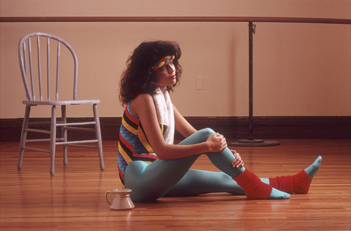
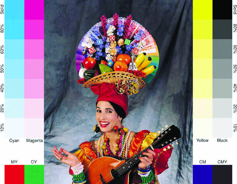
In Kodak’s original 1977 guide, one of the reference images depicts a blonde woman in a crop top and a metallic belt standing at a kitchen counter. One hand grips a knife, the other a green pepper, which, with her pinky conspicuously cocked, she seems ready to impale. A wood-paneled wall dotted with kitchen tools rises behind her; untrimmed steaks, vegetables, an orange, and a lemon are arrayed in front of her, along with packaged spices and a can of Carnation condensed milk, whose distinctive red label is just visible. Her curls and glossy half-smile are tightly set. In the companion image, a second woman, somewhat younger, stands between a dining-room table and a window opening onto a lightly clouded sky. The table is set with a vase filled with fall leaves, a fruit platter, and a candle that the woman has just lit with a long taper. The scene provides a wide array of memory colors: dried grass, foliage, citrus, blue sky. The subsequent 1988 revision of the guide included photos of a spandex-clad aerobics practitioner sitting pensively on the pale wood floor of an athletic studio, and an artist posing with a grayscale canvas against a Pollock-style paint-spattered backdrop.
These 1970s faux domestic goddesses and their more worldly 1980s sisters stood on the threshold of the world of electronic signals, posing for Kodak in order to ask a pivotal question: “Do I look all right?” They made legible how manipulations of immaterial data would affect the look of the mass-produced image. Just as imaging scientists had to abide by the naturalness constraint in developing film products, print shops had to make sure that images were bright and snappy, that they either sufficiently reproduced the chromatic distortions of the original photograph or were supplemented with additional distortions—which were often requested by print customers—without veering too far into unbelievability. The pictorial reference images helped printers prudently fulfill an oft-repeated aphorism of the industry: “Clean and bright is always right; dull and gray is not the way.”


Four of the eight pictorial reference images released by the International Standards Organization as ISO 12640 Part 1, CMYK Standard Color Image Data. Variously referred to as “natural images,” “pictorial references,” or “pritty pictures,” the image set was approved by the ISO TC 130 group in 1995, and released as an international standard in 1997.


Four of the eight pictorial reference images released by the International Standards Organization as ISO 12640 Part 1, CMYK Standard Color Image Data. Variously referred to as “natural images,” “pictorial references,” or “pritty pictures,” the image set was approved by the ISO TC 130 group in 1995, and released as an international standard in 1997.

Left: custom reference image, 1997, released by the Seattle-based digital stock-photo agency PhotoDisc, Inc. This file was included on Apple’s Classic OS 9 operating-system installation CD, released in 1999. Center: custom reference image for Getty Images, purveyor of royalty-free stock photography, circa mid-2000s (no longer distributed). Right: Adobe Systems’s “Olé No Moiré” custom reference image, circa 1994. This digital image file shipped with every copy of Photoshop 3.


Three of the sixteen reference images released by the Bundesverband Druck und Medien (German Association of Printing and Media) in 2007. Designed by the Vienna-based imaging professional Roman Keller, these images are known as the “Roman 16.”
Pritty Pictures
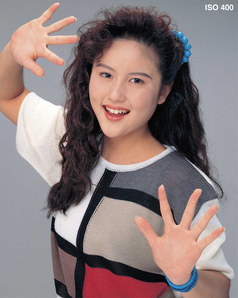
The scanner loosened the tethers that bound analog colors to their substrate, and introduced the protocols that would govern the absorption of analog media into the electronic world. And the early proprietary scanner guides acted as models for the set of standard photographs that would be used by the rapidly digitizing and globalizing image industry. In 1993, in reaction to this transformation, the Geneva-based International Organization for Standardization (ISO) established a technical committee devoted to norms related to the printing industry, whose members worked for major photographic companies and related research foundations. They began to create a set of standard “natural images,” choosing eight reference images from a vast pool of submissions; together, these represented an array of visual stressors, or qualities that catch errors in reproduction, as well as memory colors, neutral tones, and plenty of highlight and shadow areas. Fujifilm submitted a picture of a Japanese teenager in a Mondrianesque knit sweater striking a jazz-hands pose, which provides two different skin tones—the girl’s pale palms contrast with her face—as well as vivid color in her top. The Pennsylvania-based nonprofit Graphic Arts Technical Foundation contributed a “high-key,” or brightly lit, still life of a penny-farthing bicycle, whose fine wheel spokes are overlaid by the gridded strings of a tennis racquet—a devilish challenge to print. The image is larded with a spectrum-bending array of memory colors (a melon, a custard apple, oranges, ferns), alongside resolution targets and a manufactured grid of hue swatches called the ColorChecker.8 Kodak supplied a multiracial studio portrait popularly called the “Three Musicians,” which had previously been included in the revised Q-60.
The ISO working group published the first installment of its guide for the printing industry in 1997 as ISO 12640:1, CMYK Standard Color Image Data.9 The major visual tropes of the reference-image genre are all accounted for: the portrait, the dimly lit interior, the street scene, the still life (of bright metallic surfaces, plant matter, common fruits and vegetables). In an essay on the history of the efforts to make color photographs into “standard data,” David McDowell, one of the ISO committee members, winkingly refers to the test images as “pritty pictures.” Of course, these images were not designed primarily to be enjoyed; they were meant to be scrutinized—to be processed by machine algorithms, viewed on screens or pages, and then appraised by the human eye. To understand their visual logic, we might think of these images simply as information, as units of color and detail bent into baroque shapes.
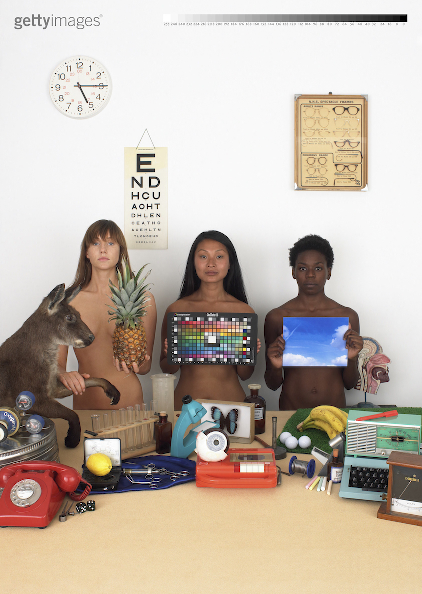
Throughout the 1990s, even as the ISO worked on CMYK Standard Color Image Data, nonstandard reference images were proliferating as distribution of digital images and desktop publishing expanded. Stock-licensing and image-editing companies began to produce free RGB-encoded test files to distribute to customers in order to help them regulate the consistency of color, detail, and resolution of images as they passed through various devices and physical instantiations; they packed these test images with as much flesh, highlight, shadow, detail, texture, and memory color as a single frame could hold. Bundled with Adobe Photoshop in 1994 was a file called “Olé No Moiré,” which features a woman in a Carmen Miranda getup with a still life of plastic fruits on her head. Photo Disc, the world’s first all-digital stock photo company, made a complex still life with composited multiracial portraits to include in every DVD of royalty-free images. In the twenty-first century, Getty Images released a particularly eye-popping test image, in which a trio of naked, unsmiling women preside over a still life of fruits, scientific objects, and taxidermied animals. The rear wall sports an eye chart and a dated assortment of spectacle frames, several of them cat-eye; the women seem to be cast as anachronistic, nudist-colony opticians. Despite the semiotic insanity, this intimation is correct, in a manner of speaking: The women are present to assess your vision.
In their aesthetic banality, reference images perhaps point to the triteness of what we want to reproduce, both in industry (properly colored products and people in advertising) and as consumers (envy-inducing blue skies in our vacation photos). At the same time, reference images—as alienating and awkward as they often are—literalize our vexed relationship with realism; if they mimic the artificiality of stock photography, or the kitschy profusions of advertising, they do so in service of processes that allow industry to both measure and manipulate all images. Standard reference images point to the slippage between technological and mathematical precision and the pull of preference; they function as both tool and metonym for the entire visual project of extracting a consistent, and consistently pleasing, representation of the physical world. “The ‘green’ of a photographed lawn is an image of the concept ‘green,’” Flusser writes in Towards a Philosophy of Photography (1983). “There is, however, a very complex series of successive coding processes between the photographic green and the green ‘out there’ . . . the ‘truer’ the colors of a photograph become, the more mendacious they become. They hide their origins as theory more effectively.” The more saturated blue skies you see, the less you notice that an alteration has taken place.

William Christenberry, Church, Sprott, Alabama, 1971.

Jan Groover, Untitled, 1978.

Joel Sternfeld, The Space Shuttle Lands at Kelly Air Force Base, San Antonio, Texas, 1979.
They’re the Pros
In 1981, five years after MoMA’s Eggleston show, New York’s International Center for Photography mounted a group show called “The New Color Photography.” In addition to Eggleston, the exhibition featured such artists as Stephen Shore, Jan Groover, Joel Sternfeld, and William Christenberry, all of whom had put on prominent solo shows in the previous decade. A movement was afoot, and it was time to gather its adherents and make a canon, under the informal rubric of “newness.”
In her catalogue essay, curator Sally Eauclaire attempted to account for some of the aesthetic issues that may have previously militated against the acceptance of color photography in the art world. Film’s “exaggeration of subject hue” was one problem, because it “gave the medium an aura of vulgarity.” Color photography had an unfortunate inclination “to alter rather than duplicate the world’s colors, producing extravagantly lush, festive hues from less flamboyant sources.” But Eauclaire believed that a decisive shift had occurred in the 1970s, after color photographers “modified their traditional naturalistic priorities . . . by careful framing of a selected section of the world,” and in so doing “learned to anticipate and enlist color film’s hue exaggerations.”
Others argued that the admission of color photography into the rarefied realm of fine art had more to do with the medium’s evolving capacity to depict the world accurately—that the removal of various technical obstacles led to images that seemed more acceptably natural. But, in fact, the attainable level of saturation in color films increased throughout the 1970s and into the 1980s; Kodak and Fuji battled for market dominance, with Kodak’s engineers amping up the chromatic effects and Fuji developing its own films that were popular for their hypersaturated, nearly psychedelic colors, which even entailed occasional “mistakes” in the rendering of memory colors. In the accounts of imaging scientists, during that time period, both consumers and professionals in preference testing always asked for as much (credible) saturation as the scientists could squeeze from the chemical medium—and scientists delivered. So if there was no quantum leap in color film development from the 1960s to the 1970s, just the same struggle to increase color as much as possible within the naturalness constraint, how did color come to seem more “natural” under the skeptical, unforgiving light of the white cube? As Malcolm wrote in her Eggleston review, the American visual environment was now full of “recently made structures, machines, and objects; by people dressed in clothes of the cheap, synthetic democratic sort; by the signs and the leavings of fast food, fast gas, fast obsolescence.” Fast, cheap—and bright.
What has been considered synthetic, exaggerated, or natural in color photography only reflects our preferences, our ideas about the desirability of a look. These received forms have become pure content, since classic analog-era looks can now be applied to any digital image at all. Numerous programs and apps have experimented with algorithmic simulations of specific film products that had so carefully mediated between preference and pleasingness, between the naturalness constraint and the constraint of chemical materials. Instagram’s early filters were designed to mimic degraded analog renderings as a means of masking the obvious errors of poor-quality first-generation phone cameras, but no longer: As one Instagram engineer says, their objective now is “just to figure out what’s pretty.”
In 1971, Stephen Shore, one of the “New Color” photographers, decided to shoot pictures of the decidedly unglamorous town of Amarillo, Texas, and produce postcards from the resulting urban landscapes. He sent his images to a professional postcard printer in upstate New York. Though the summer heat had yellowed the grass in front of the Amarillo courthouse, the postcard edition depicted it as green. And though Shore shot his image of a local barbecue joint on a cloudy day, the printed card showed a brilliant blue peeking out from behind the clouds. Rather than complain about the distortions that the printers had wrought on his work, Shore shrugged it off, explaining to a curator years later that the printers “never asked, they just did it. They’re the pros. They know how postcards should look.”
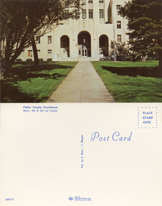
Stephen Shore, Potter County Courthouse, 1971. Postcard from the series Amarillo—Tall in Texas.

Stephen Shore, Doug’s Bar B Q No. 1, 1971. Postcard from the series Amarillo—Tall in Texas.
1 A development then being explored, for example, by László Moholy-Nagy and other New Bauhaus practitioners. Steichen’s focus on photography as a popular medium, rather than a fine art, defined much of his tenure at MoMA; many of his shows, including the blockbuster “Family of Man” (1955) drew from the tactics of editorial photo essays found in mass-circulation magazines.
2 There were actually several other exhibitions of color photography at MoMA prior to Eggleston’s show, including solo presentations of color work by Marie Cosindas, Ernst Haas, and Helen Levitt.
3 For cogent analyses on the representation of race in filmic materials and reference images, see Richard Dyer, “The Light of the World,” in White (London and New York: Routledge, 1997); Lorna Roth, “Looking at Shirley: The Ultimate Norm,” in Canadian Journal of Communication 34, no. 1 (2009); and Genevieve Yue, “China Girls on the Margins of Cinema,” October 153 (Summer 2015).
4 This effort coincides with a global movement to standardize all kinds of products, manufacturing processes, and measurements (of time, space, quantities, distances, economies), spurred, in part, by societies of engineers and scientists and the development of international communication networks that required coordination to function properly.
5 The word rendering is used variously within the industry; some scientists use it to refer to any form of image processing, while others consider the “rendered image” to be any final image produced to look pleasing to a human observer.
6 This basic requirement of color imaging is noteworthy in light of some of the long-standing assertions about the nature of photography’s relationship to reality, namely, that it is “perfectly analogical” and “indexical,” i.e., directly created by the light that forms it. The indexicality of photography was perhaps most forcefully argued by Rosalind Krauss in 1977, by way of a passage from Roland Barthes’s 1961 essay “The Photographic Message”: “From the object to the image there is of course a reduction—in proportion, perspective, color—but at no time is this reduction a transformation (in the mathematical sense of the term) … it is exactly this analogical perfection which, to common sense, defines the photograph.” Nothing could be further from the truth.
7 The three colors are normally supplemented with black, although it appears that for the sake of simplicity Steichen’s display omitted the black separation. Color separations can be difficult to grasp: Red, green, and blue combine to form the visible spectrum in the “additive” color model in which wavelengths of light are combined; but in print (a “subtractive” process), colors are created through red, green, and blue’s complementary pairs—blue-green (cyan), reddish-blue (magenta), and yellow. A photograph must be optically divided into the “subtractive” color primaries for reproduction on the printed page, so that each color can be inked onto a separate printing plate (with the addition of black, on a plate of its own), and then pressed in succession onto the sheet of paper.
8 The ColorChecker was developed in 1977 as a “standard test object” for photography, television, and printing. Formatted in the rough proportions of 35mm film, the ColorChecker features one row of grayscale patches, and one row featuring the red, green, and blue of additive color mixing as well as the cyan, magenta, and yellow of the offset printing process. These two rows include patches of color associated with “objects most likely to be considered critical in general-purpose imaging”: approximations of dark skin, light skin, blue sky, a “typical” leaf, a chicory flower, oranges, grapefruits, and lemons. This orderly grid of known wavelengths synthetically represents the perceptual world.
9 The first image set was CMYK; the four subsequent ISO image sets have all been variously encoded for different uses.